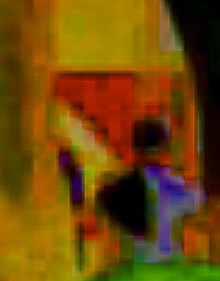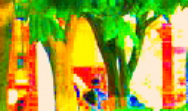
The same section as above, with more of the background kept in. Pixelated in a brighter coloration. I like what's happening at the far right, at the bottom middle and at the far right. Wish I knew how to erase the trees and zip those parts together on the computer. As it is, I will probably play with this on paper.

The far right portion of the photo above. Played with a lot more. This as real potential.


5 comments:
Deb, The long vertical is so abstract...you simply must translate this into fabric...
This is way too cool! What program are you using to alter these photos? If I were you I'd definitely make up the long narrow one in fabric.
I like all the images, but I'll add my vote for the long and narrow one. Jen
Very interesting. And I bet if you and Melody both made pieces inspired by this piece they would both be so different -- and equally super fantastic, of course.
I LOVE that last one! It would look wonderful in fabric.
Post a Comment